
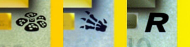
So now that I’ve readjusted which Pokémon will be which non-Dragon, non-Fairy types in my Space World sets, the next thing to figure out is… the set icons! And more importantly, what style? Well, below I have some of set icon ideas for the three sets. The icons themselves aren’t necessairly finalized, although I’m likely going to stick with something along these lines. But that said, there are two styles for them which I’m still mulling over… but take a look first and I’ll talk details afterwards:
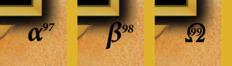
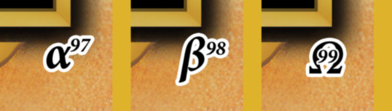
Anyways, the two styles are based on how set icons were done in times before:
- the first style is based on the early era of the game (Jungle, Fossil, Rocket)
- the second style is based on the Neo era of the game (Genesis, Discovery, Revelations)
You can see what I mean below.

I mean… I guess it is pretty self evident what I should do. Afterall, I am trying to make this set have a Neo-style look to it, but to also have it reflect modern changes to the game… and even the modern sets use the white-bordered set icons.
But I feel like the Neo-style icons are a bit too bold and jarring, while the pre-Neo icons blend into the card a bit better.
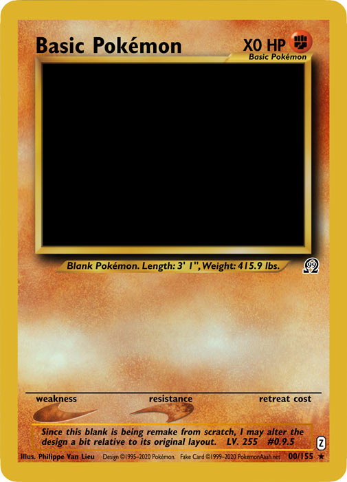
Here, lemme add in a couple quick examples of the icons on a full size blank:
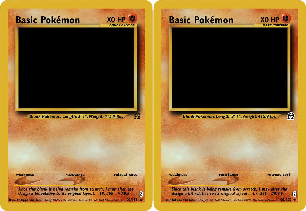
So, I dunno. Maybe the icons are too big? Maybe I used too much white border and I should therefore take it down a notch?
Anyways, I’m gonna mull on this. If you have any ideas, leave some in the comments, or maybe voice your opinion over on the Discord server! The PA! Discord server is still 100% free, but it might not be so in the near future, so pop on in while you still can!